

Visualizing the Pandemic
This collection contains work by Carleton students in "IDSC 100.05: Data Visualization As Activism" during Fall 2020. The course was taught by Director of the Quantitative Resource Center Lin Winton as a first-year Argument & Inquiry seminar. Students created visualizations using data from the Covid-19 pandemic.
-

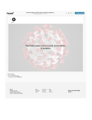
The Politicization of the Covid-19 Pandemic in America
Nathan Campbell
This visualization explores the connection between pandemic response (and impact) and presidential voting patterns. Looking at rates of cases per 100,000 people and election results from the 2016 presidential election, the visualization shows how many of the states with higher case rates voted Republican in 2016.
-

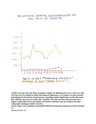
Minnesota: Getting Lackadaisical in the Face of COVID-19
Sophia Colalillo
This visualization explores differences in infection numbers and social practices between April and October 2020. By October 2020 precautions to slow the virus were lessening as things began to open back up, despite higher than ever numbers of new cases, in contrast to April, when Minnesota had lockdowns when the virus first arrived and had relatively low numbers of infections.
-

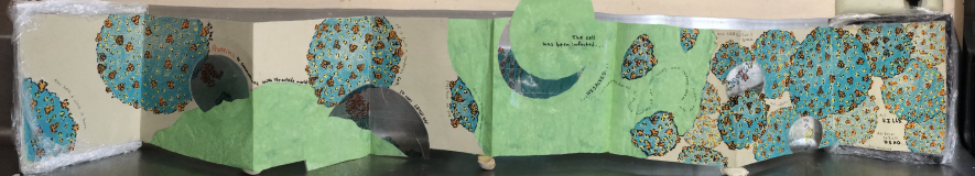
It's a marathon, not a sprint.
Alistair Pattison
This visualization discusses "flattening the curve," showing how slowing transmission with lockdowns and other health precautions gives time for healthcare infrastructure to prepare and spreads out the patients.
-
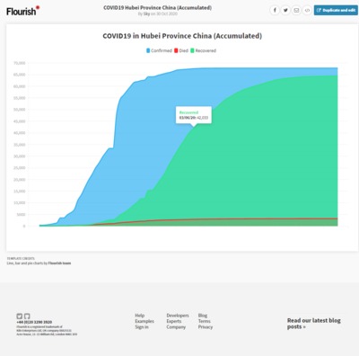
 by Sky")
COVID19 Hubei Province China (Accumulated)
Sky
This visualization looks at Covid-19 cases in Hubei Province in China from January to April 2020. The graph shows the total number of cases, those recovered, and those who died, all cumulatively.
-

Visualizing the Covid-19 Pandemic Assignment
Lin Winton and
An assignment for students to create a visualization about the COVID-19 pandemic.
